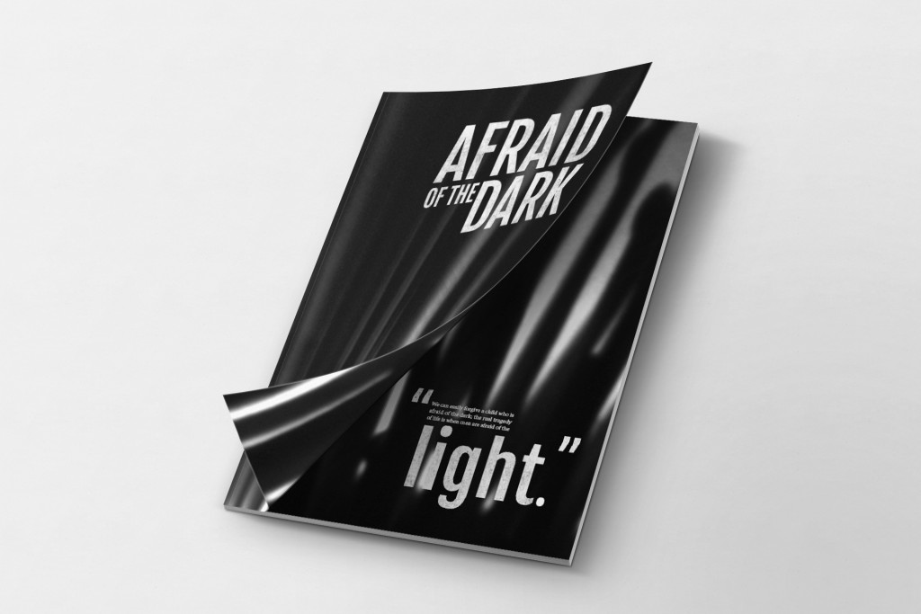
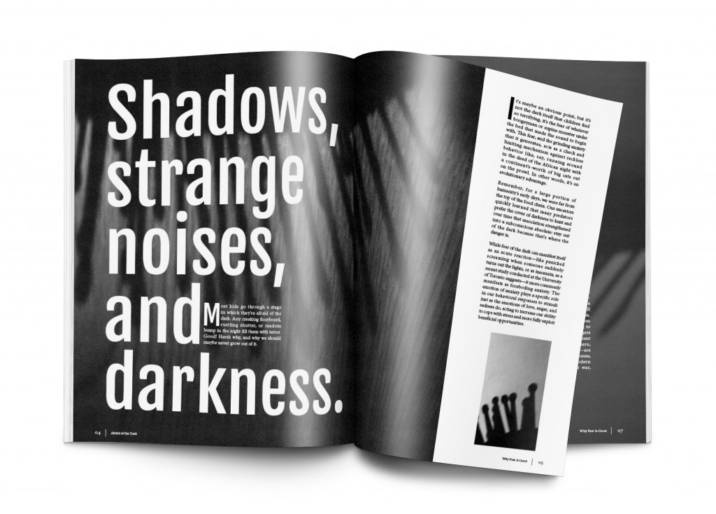
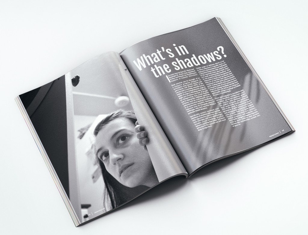
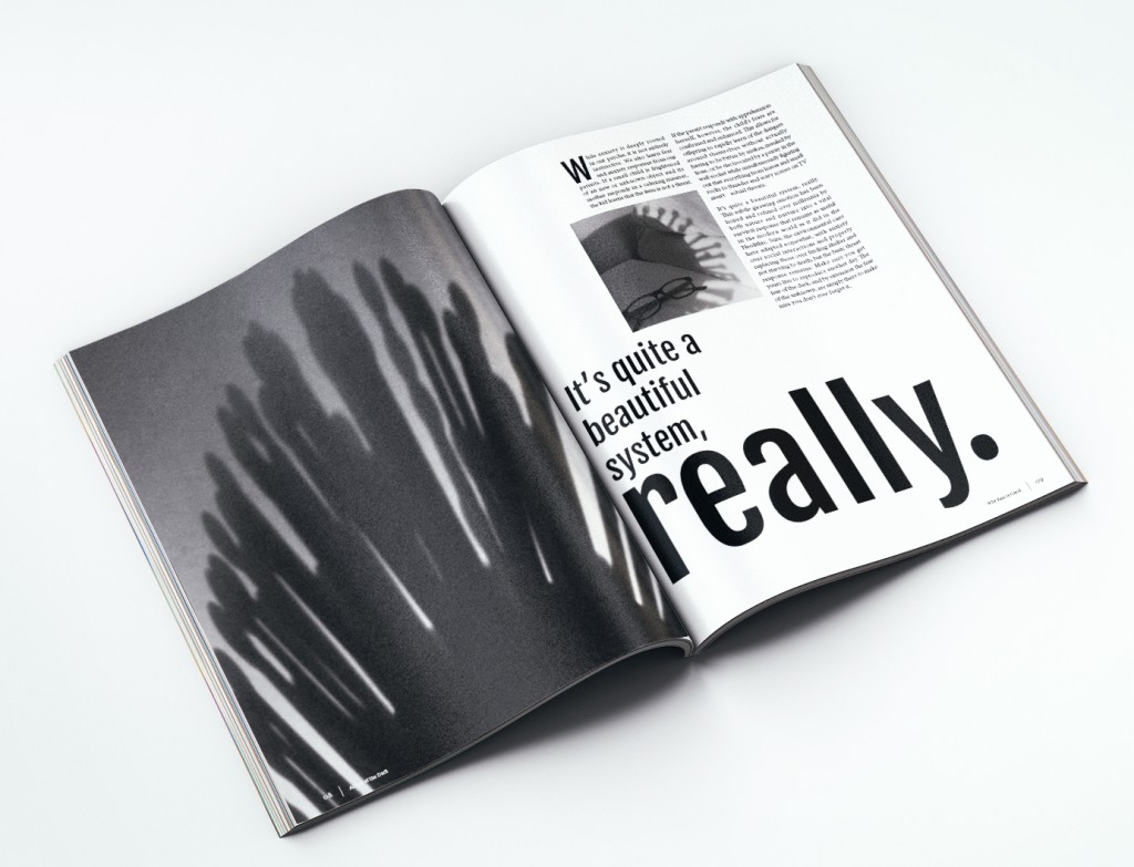
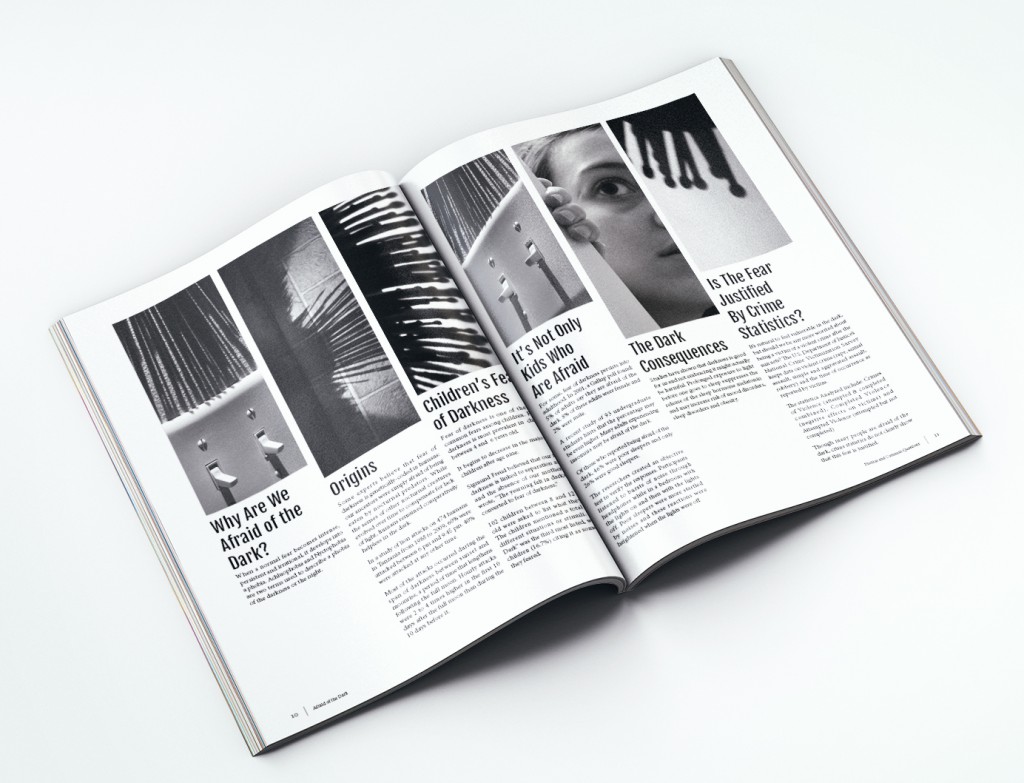
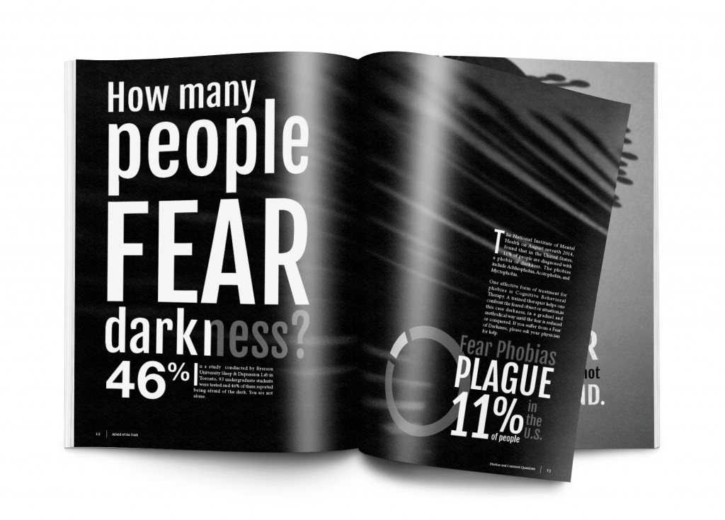
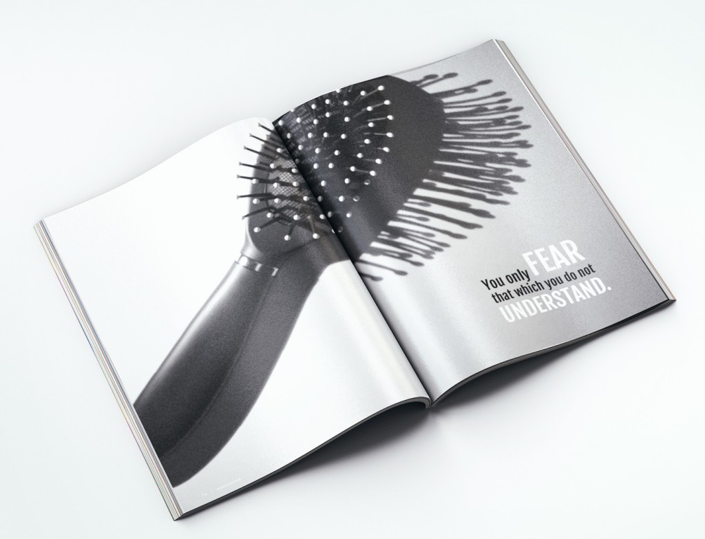
For this project I created a 16 page magazine with the theme “Afraid of the Dark.”
The magazine was actually created backwards
This project was a school assignment so the first thing I did was pick an object. One that I could take with me wherever I went.
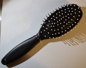
I chose a brush.
For no particular reason. I just had to choose something.
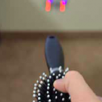
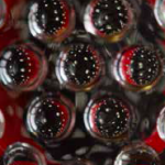
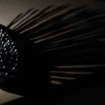
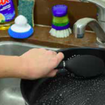
Then I was challenged to take as many photos of the brush as possible. I took some from different angles and perspectives. I would make holes with the brush or paint with the bristles or drag the bristles through dirt and salt and take pictures of the result. I would put the brush in water. Personify it and pretend it was a monster. Have it climb a tree. Use it to eat food. and more.
What I did with the images
After weeks of taking creative images of the brush, yes weeks (this project spanned a semester), I finally was told to come up with a theme or idea for a magazine that fit with my images. Well I’d taken so many pictures, was there a unifying theme? Which images should I use?
I looked at all my images looking for topics.
Idea one
I thought I would take the images I had that made the brush look scary and like an animal you have to tame, and create a magazine about being afraid of what we do not understand. I really liked the topic…but the topic didn’t like me. No, just kidding. The topic just didn’t work well because I didn’t actually have the best images for that idea, and I couldn’t find very much information about the subject.
Content for the magazine could be sourced from anywhere, or I could write it myself. The requirement was to have at least 1000 words.
Idea two
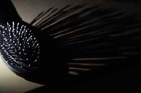
For my second idea was a spin off the first. I liked the idea of making the brush seem scary. Then I noticed one of my images that showed a shadow of the bristles of the brush.
This made me realize that I could portray the shadows in a scary way and my book could be about being afraid of the dark. Which leads me to another project requirement:
I needed to include at least two graphs or charts in the magazine.
Execution of idea two
In this step I took more images. I only had a few images of shadows. So I spent a couple more days taking more images to fill the magazine. Then I decided to find the content. I ended up using two different articles and data from another two sources that filled the magazine.
Research
What? research is usually the first step…
Not this time! Now that I had the images and the content, I needed to create the magazine. So backwards right? I looked at infographics, posters, books, type posters, and typography in general. Here is my pinterest board of inspiration:
Follow Bethany’s board Pet Project on Pinterest.
Final magazine
What I learned
I took photos of an ordinary object, but in an interesting way that created captivating images which contributed to the overall feel of the magazine. I learned what it means to be creative with images.
I got more practice with typography and hierarchy. I learned that some words can be emphasized and presented much larger than the body text and that will create a dynamic and visually interesting layout.

