
The goal of this project was to create a logo that branded myself. My initial requirements for the logo were that it take these three things and put them together in a simple and clear way.
- B for my first name
- L for my last name
- Symbol for “web”
As a part of this project I took some time to think about what defines me. I asked some people what they think when they think of me. I didn’t end up using any of their comments because in the end I chose to create a logo that would look like it belonged to a design firm, instead of an individual. So I didn’t put my personality into it, other than I applied the design principles I’ve learned and took the personality of design firms and tried to do something similar to their logos.
Initial sketches

![]()
The letter B isn’t working.
Once I had realized that a curved B looks inappropriate in a few of these sketches I realized that I either need to make a B without curves, use a lower case b or nix it all together. I tried all three.

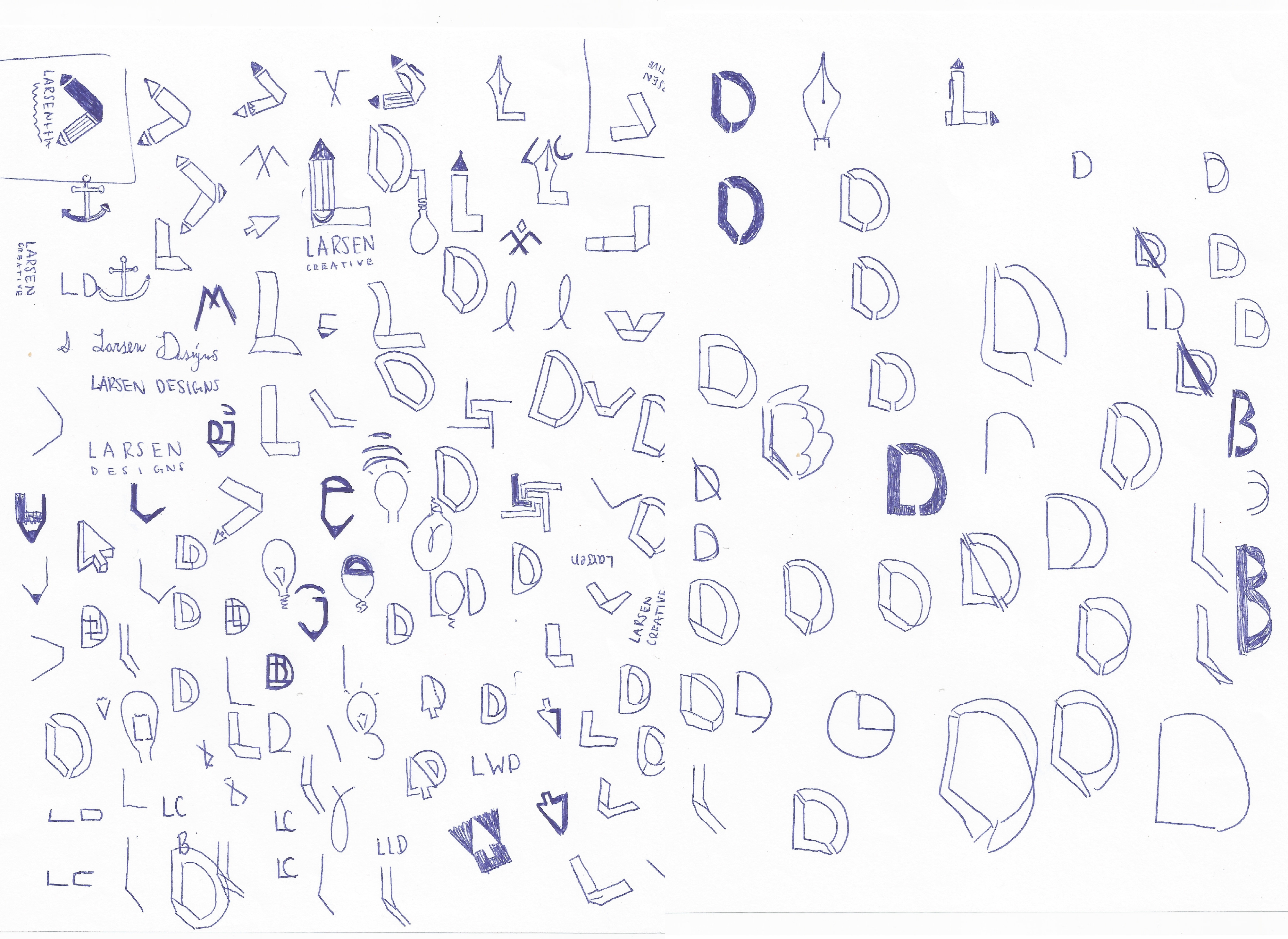

Yet another approach.
My sketches still aren’t working. To break of out my mediocre sketching, I took a whiteboard and instead of sketching small on paper, I used the board to make big sketches. I tried to think about new options, new company names I could use, new symbols. I wrote down what I would want as if I was the client giving this job to someone else. This helped me get back to the purpose of what I really wanted out of the logo.
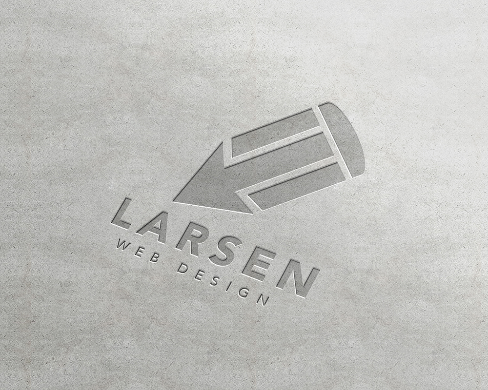
I realized the most important thing is not that my initials are in the logo, but that the logo says, “designer” and “web.”

Making new connections.


Adding color.


The final reaping.
In the end I chose to go with the logo that best incorporated the two words, web and design. The one with the mouse cursor ‘arrow’ and pencil definitely won out. This logo incorporated two symbols really effectively and simply. I’m really happy with it because it looks like a logo that a real design firm would use. This is the logo that I will use in the future.
