Automate repetitive sales motions and hit quota faster.
Sales Team Managers are always looking for ways to speed up their sales floor to make more sales. Robots is designed to allow Managers to easily set up rules that say, for instance, “When a new lead from the website comes in, send it to this sales team.” or “If a lead’s renewal date is in a week, then notify this Sales Representative.”
Purpose
To provide Sales Managers with a simple to understand interface for automating sales motions.
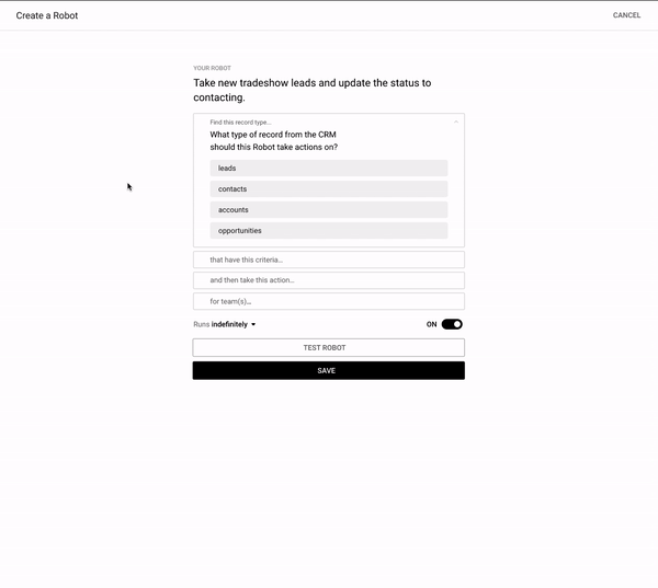
The Old Design
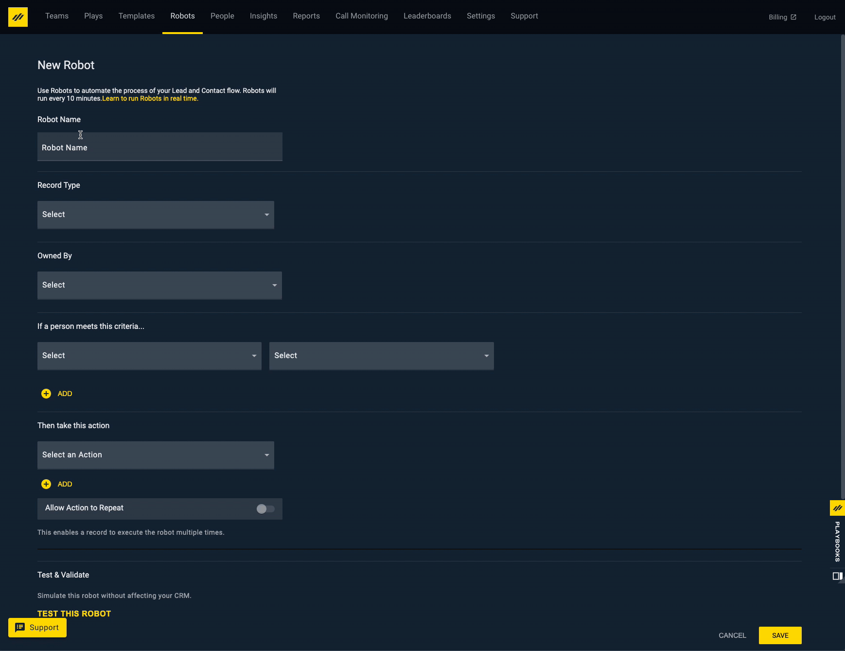
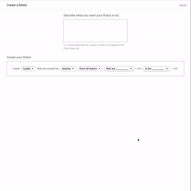
Current design used to create a Robot today
The problems with this design:
- Takes a lot of mental load to fill out, based on it’s poor organization
- Some fields are not labeled
- Some labels are very confusing
- It’s impossible to quickly understand the Robot’s criteria and actions it’s taking.
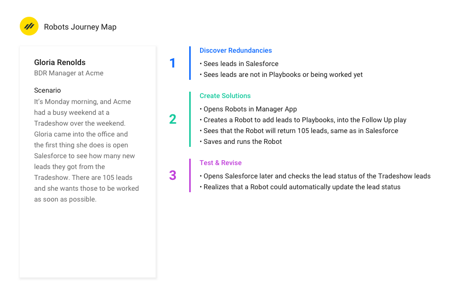
I created a User Journey Map to help guide the team as we began creating rough designs
Then jumped into Invision Freehand to visualize user flows
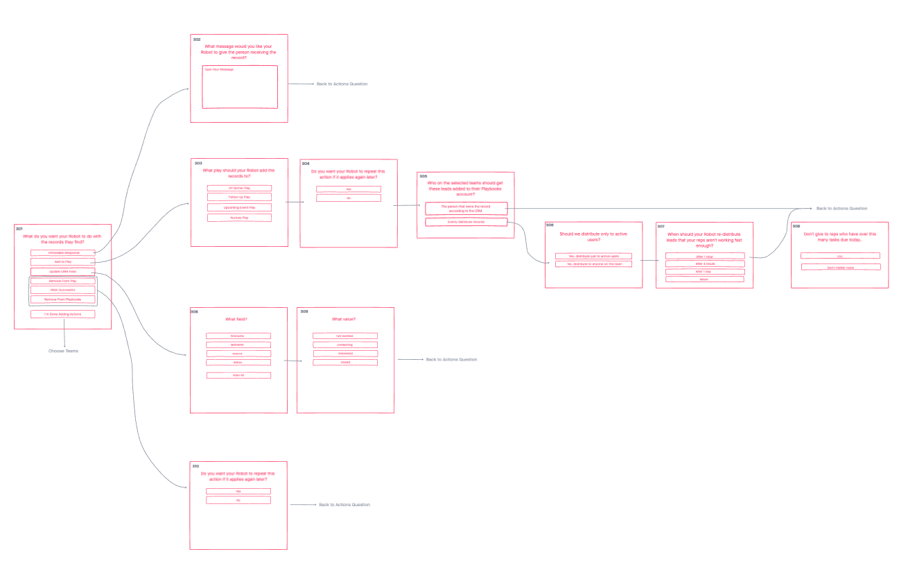
Creating flows for each type of criteria
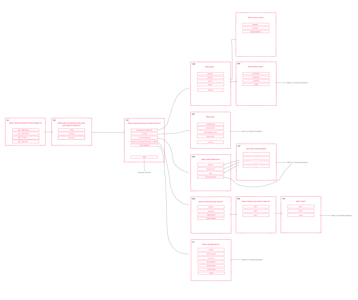
Creating flows for each Robot action
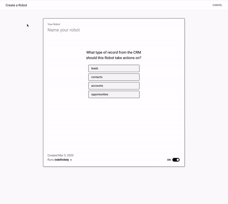
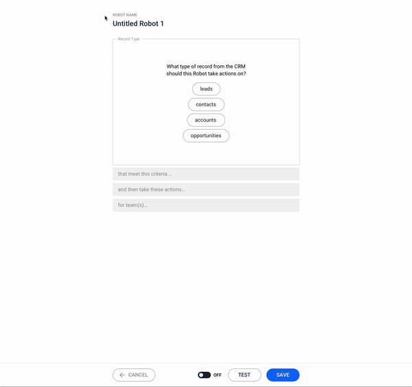
Created and tested a lot of prototypes
Feedback:
There are too many places the sentence is being created, and too many ways to edit it. We want the focus to be on one thing at a time, but still allow power users to get through the creation process quickly if they already know what they’re doing.
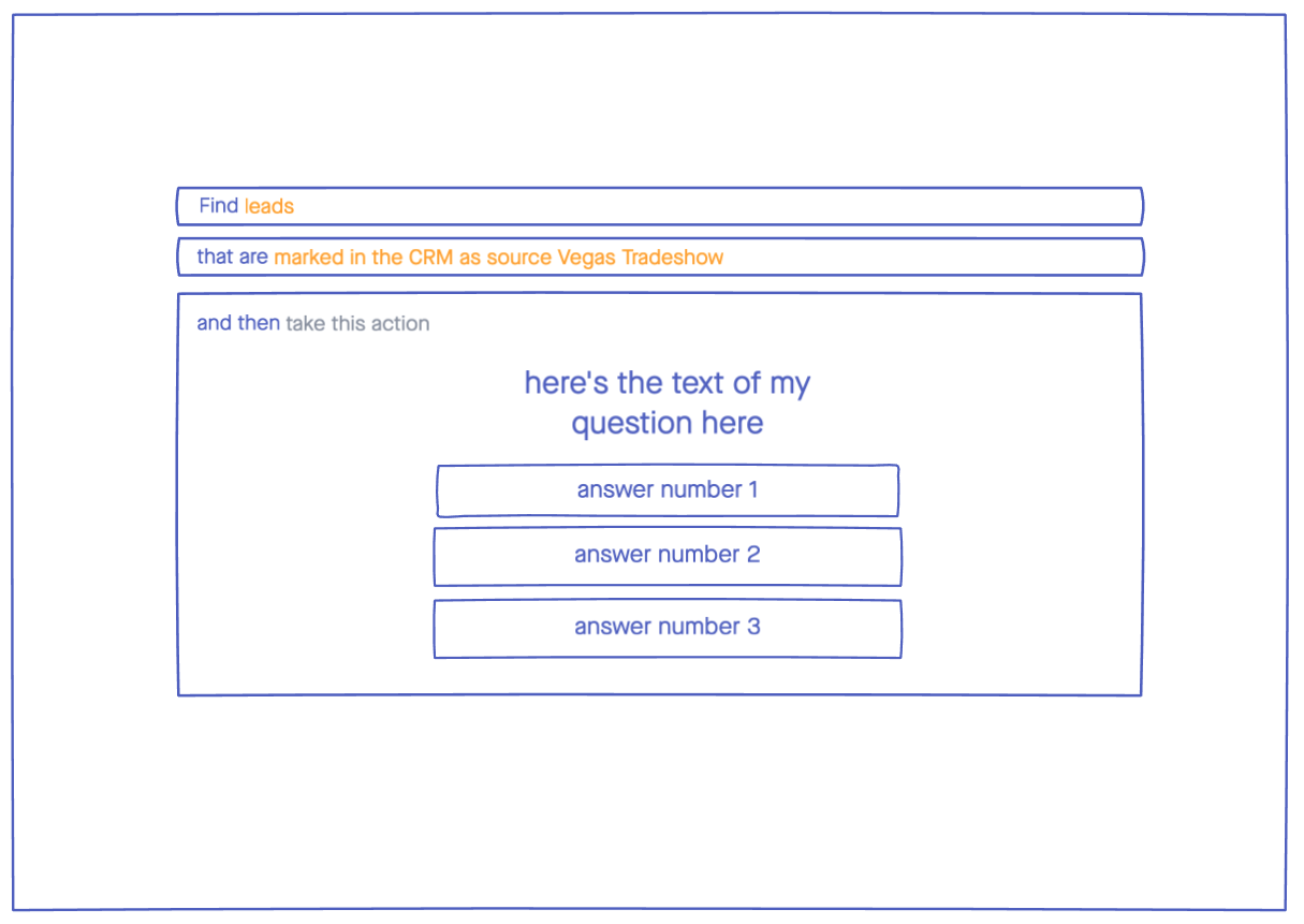
Feedback:
The sentence didn’t look quite like you could edit it and it was all together so it got muddy again. The idea was to take the separate line idea and the boxes and add that into this idea, but the boxes wouldn’t have drop downs. As I started to do that, I ended up with these designs where I was trying to make what you’re editing more obvious using color on the one and placement on the other. Neither felt right.
Back to the whiteboard
At this point, I scheduled 6 internal interviews with people who are familiar with the current process we have today. The first one was on Friday and the rest were scheduled for the next Monday and Tuesday. The first one went so well that I had such great direction and enough time to make edits for the next 5 interviews.
The main pieces of feedback were:
1. The sentence doesn’t read well. You have to keep rereading it so the question isn’t actually helping, but making me slower to understand.
2. The times when you’re selecting fields from your CRM, that should be perfectly clear.
3. You have to scroll around to see everything, but I need to be able to read the full sentence I’ve built so far and the current thing I’m on at the same time.
4. Use more of the horizontal space since this is a desktop app only.
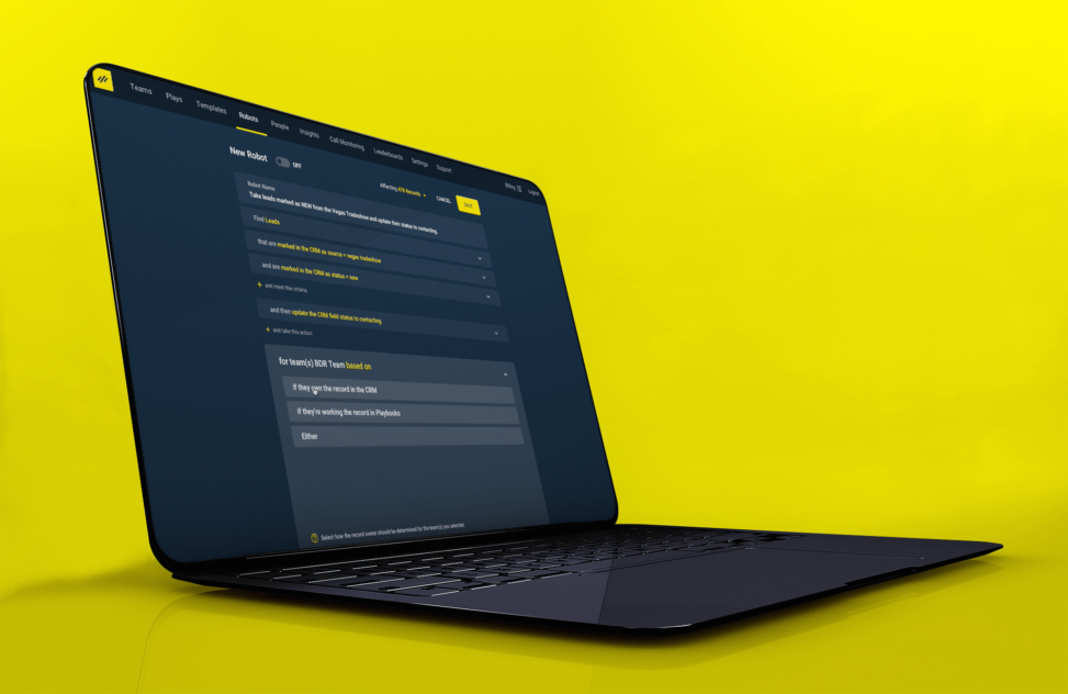
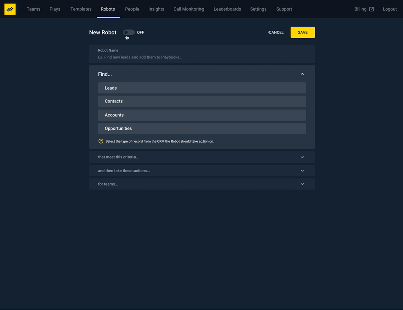
The Final Design 👌
Thanks for reading!
Featured image mock up credit: Mockup psd created by xvector – www.freepik.com